Even though I try to avoid using colour in my own work, I find it fascinating to see in other peoples. The video above shows the process Holton Rower uses to create these psychedelic pieces. To it simply, they are beautiful especially when time lapsed.

Sunday, 13 February 2011
Tuesday, 8 February 2011
Just a touch of love...

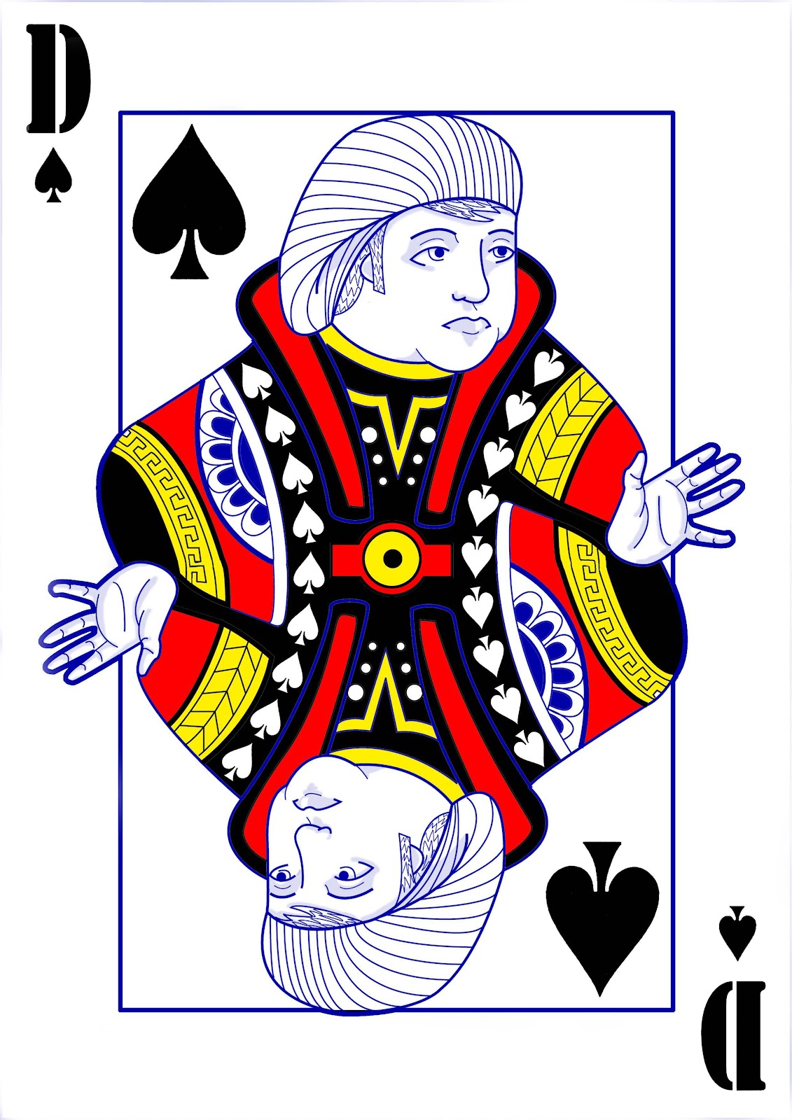
Above: The final handrawn sketch from my sketchbook.
Below: Final outcome.

This year to help with the funding our course decided to
have a Valentine's Day card sale with some of our designs on them.
This is the piece that I submitted.
Keeping to the Art Nouveau theme that I love
so much of course!
Christmas Card :)

This year in uni I was lucky enough to have a design I re-worked
get accepted by Swansea Metropolitan. However as I didn't know
Illustrator that well they asked Tom Ward
to finish the piece up in the program.
So I tried my best and this was my version
which I am very happy about.
Sunday, 6 February 2011
For my sister...

This was a piece I did for my younger sister for her birthday.
Swallows are her favourite bird so naturally I drew her one.
I'm pleased at how well it came out as I don't normally
draw birds unless they are heavily stylized in some
shape or form.
The Second Year work scavenge!
Seeing as I had posted my first year university artwork I thought I'd go on the hunt for the artwork I had done in the second year.

This was supposed to be a design that would have
eventually made it onto a t-shirt.


The images shown above are the final pieces for a module we did
on graphic novels and children's picture books.
I'm actually really happy at how they turned out.
This was actually meant to be a self-portrait of some kind,
I'm happy at how it came out considering it was one of my Illustrator pieces.


These pictures were all for a module on book covers.
I have shown the developmental pictures as I think they are interesting to see.

My final piece of an advert for Plastic Surgery.

The image above shows the characters I created
for a packaging project, which was for condoms.
All of the animals have been drawn to look like they
have been made of of condoms and represent their respective types:
featherlite, tingle, variety, XL, Extra Safe.


These pieces are all from my Illustrator elective to redesign classic
book covers. Heavily inspired by Jasper Goodall.
Friday, 4 February 2011
Some golden oldies from the first year of uni!
I was sifting through my hard-drive just now I stumbled across some of the work I did in the first year of University. Here they are enjoy.


The six above drawings were all done for a project on covering a Dell laptop,
unfortunately I can't find the overall finished images of when they were applied to the laptop itself.


These two images for Priscilla, Queen of the Desert were made
from a sand sculpture done on the beach and then attacked with Photoshop.


The five pictures above were for a project based around editorial pieces in the Guardian.
Each piece had to be created using different materials.
From 1st of the 5 images: created in illustrator, scraper-board and photoshop, lino print and dried tea,
photograph and photoshop and lastly, newpapers, ink and bleach.

This piece was done for an elective in my first year.
The final is made up of 700 or so images of people from halls' faces scanned
with a normal printer/scanner.
Welcome to Being Pandantic
Hi there everyone, well after many a demand for a blog of my work I am happy to adhere and present Being Pandantic, which'll be used to help me promote Pandantic Illustration :)
This blog will be used to showcase the work I've been working on, submitting for competitions, commissions etc so you can all see what I do.
As ever all comments and criticisms are welcomed when it comes to my work and when I finally upload some images of my work I look forward to hearing what everyone thinks.
Thanks,
Dan
Subscribe to:
Posts (Atom)